A local bakery app makes ordering a piece of cake! With a user-friendly design and customizable options, getting your favorite pastries has never been easier.
Role | UX/UI Designer and Researcher
Timeline | April 2024 - July 2024
Tools | Figma, Miro
Ordering pastries can be challenging, especially for Betty’s Bakery’s regular customers, who are often older and may have disabilities. Betty’s Bakery needs to address issues with complex navigation and limited customization options when creating the app to ensure a simple and accessible ordering experience for all customers.
🤔 Problem
If Betty’s Bakery creates a simple, accessible, and user-friendly app, all customers including those with disabilities will have an easier time placing orders, customizing their cakes, and tracking their purchases.
💭 Hypothesis
Create an app with simple navigation, a user-friendly interface for quick ordering, high-contrast colors for better legibility, and support across various devices. Additionally, live customer support will assist users throughout the ordering process, ensuring a seamless and accessible experience for all customers.
🏆 Solution
Introduction
As part of Google’s UX Design Certificate, I created a conceptual project for a small-town bakery, Betty’s Bakery, aimed at addressing the challenges faced by its older customers. The project focused on designing an intuitive app with simple navigation, high-contrast colors for legibility, and quick ordering features to improve the overall experience. My goal was to create an accessible, user-friendly solution that would streamline the ordering process for all customers, especially those with accessibility needs.
I started my project by exploring apps from direct competitors, like local bakeries, and indirect competitors, like food delivery platforms. I looked at their features to see what worked well and what could be improved, helping me find ways to make Betty’s Bakery’s app better.
📝 Research
Direct Competitors
Panera Bread’s app is widely used for ordering food, including bakery items, soups, salads, and sandwiches.
Easy-to-navigate interface with clear categories
Use of bright colors
Likes
The design seems cramped, making it harder to navigate
Dislikes
Likes
Dislikes
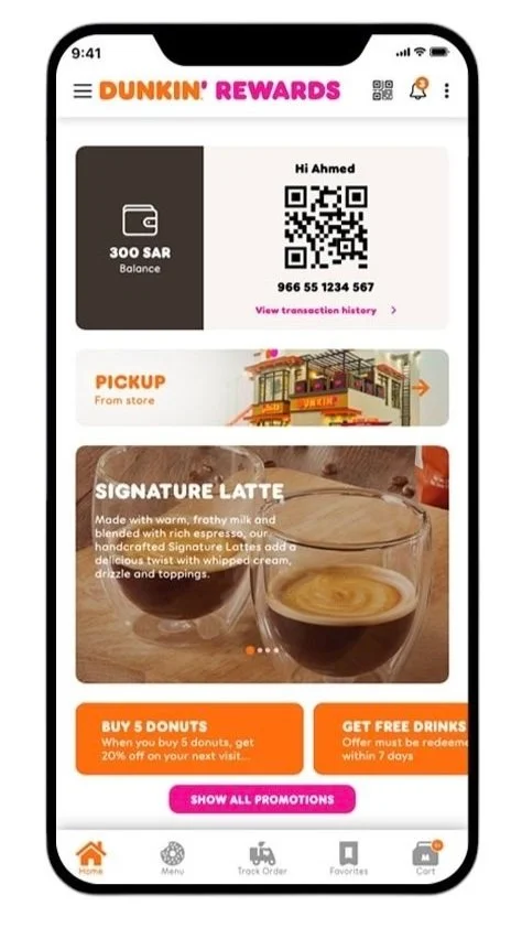
Dunkin’ app is widely used for ordering coffee, donuts, and breakfast items,
Loyalty program encouraging repeat order
Customizable Order
Navigating can be a bit tricky in some areas of the app
Indirect Competitors
Walmart’s app is widely used for shopping a wide range of products, including bakery items,
Likes
Integration with in store pick up
Easy check out process and order tracking
Dislikes
Navigation is a bit cluttered
Target’s app is widely used for grocery shopping, including bakery products
Clean interface with great product visuals
Easy access to coupons and deals
Likes
Dislikes
None
After reviewing competitors, I found ways to improve the experience and want to incorporate these aspects into Betty’s Bakery.
I want to
Simplify navigation and the ordering process for users with visual and motor impairments.
Enable easy customization of orders with a simple filter for dietary preferences.
Provide clear, step-by-step instructions to simplify the scheduling process.
To gather more insights, I conducted interviews with six people using three survey questions. Here are some of the responses I received.
What features make the ordering process convenient for you?
“A quick checkout option with saved payment methods makes it super convenient.”
“A quick reorder option for previous purchases would save time.”
“I’d use it more if there was an easy way to track order status in real-time.”
What do you think could make the bakery app easier to use for someone with limited time or who is on the go?
“I like apps that allow me to schedule my pick-up time in advance.”
“A one-click ‘order again’ feature would help make the process quicker.”
“Clear product images and descriptions help me decide faster.”
What kind of features or options would encourage you to use the bakery app more often?
“If the app offered special deals or promotions, I would use it more.”
“Adding a ‘favorites’ section where I can quickly reorder items would make it more convenient.”
“Having a simple home screen with easy access to popular items would be helpful.”
👤 User Personas
Based on my research and interviews, I created two personas to represent the main findings and better understand the needs and behaviors of different users.
💡 Ideate
Before prototyping, I mapped a key user flow for a simple ordering process. I used storyboarding to visualize the journey, Crazy 8’s to explore design ideas, and wireframes to structure a user-friendly layout.
User flow
I used user flows to outline key actions, guiding my design for a seamless and intuitive app experience.
used storyboarding to map the user journey and key interactions, ensuring a smooth and engaging app experience.
Storyboarding
Big Picture
Close Up
Crazy 8
I used the Crazy 8 method to quickly sketch six different ideas. The one with the red marking is the design I liked the most and decided to move forward with.
Wireframes
used wireframes to design a clear, user-friendly layout, organizing content and navigation before making detailed prototypes.
📐 Prototype
After completing the user flows, storyboarding, Crazy 8s, and wireframes, I moved on to prototyping. This allowed me to bring my designs to life, creating interactive mockups to test and refine the user experience.
Assigned Task
➡️
Low - Fidelity Prototypes
used low-fidelity prototypes to test and refine the user experience before creating high-fidelity designs.
After completing the low-fidelity prototypes, I tested the app with friends and family, ages late teens to late 50s, to gather feedback and improve usability across different user groups.
To order a chocolate cake through the app and have it delivered straight to your doorstep.
Based on key takeaways, I will improve the app’s usability by refining the delivery setup with clearer instructions and a guided process.
Before usability test
Based on my findings, the lack of customization options for delivery and pickup date and time may create challenges for users trying to fit the service into their schedules.🔍 Findings 🔍
5/5 users found the interface useful.
3/5 users felt some initial confusion when getting started.
4/5 users had a confused tone at first, but 2/5 became more confident by the end.
3/5 users struggled with navigation.
2/5 users found setting up a delivery order confusing.
❗ Key Takeaways ❗
Improve Onboarding: Since 3/5 users found the app confusing at first, focus on simplifying the onboarding process to make it more intuitive.
Streamline Navigation: As 3/5 users struggled with navigating the app, consider enhancing the navigation structure to make it more straightforward.
Clarify Delivery Setup: With 2/5 users finding the delivery order setup confusing, consider providing clearer instructions or a guided process to make ordering and delivery options more user-friendly.
➡
After usability test
After the usability study, the new solution allows users to choose a date and time that fits their schedule, leading to a more seamless and convenient experience.Based on key takeaways, I will enhance usability by making onboarding more intuitive, streamlining navigation, and improving the delivery setup with clearer instructions and a guided process.
➡️
After usability test
After the usability study, the improved design features a more intuitive onboarding process and a streamlined navigation system, allowing users to complete their orders with ease.Before usability test
Before the usability study, users struggled with the app’s navigation and onboarding process, making it difficult to place an order smoothly.Objective
To determine if tasks are simple and intuitive while evaluating the ease of navigation within the app.
Sign-In Screen
Menu
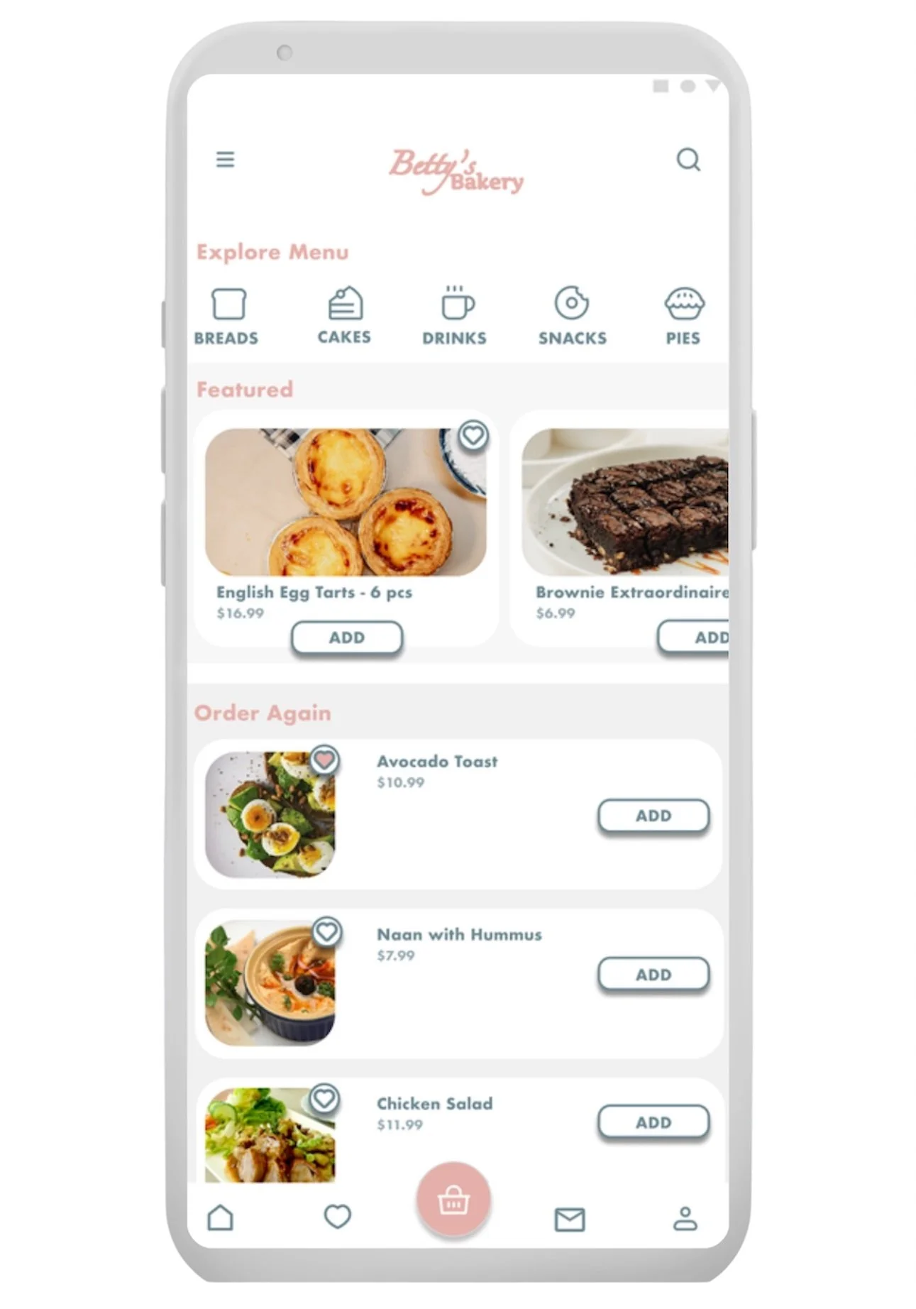
Order Again Feature
Allows users to quickly reorder their previous purchases with just a few taps, providing a convenient and time-saving option for repeat orders.
High - Fidelity Prototype
Here are some examples of the high-fidelity prototype, showcasing the improved design and enhanced usability based on user feedback.
Home
Product Page
Side Menu
Cart
Customized Order
A step-by-step process that lets users customize their order, ensuring they can easily choose from a variety of options and receive exactly what they want.
Order
Location Map
This provides users with a clear, real-time view of their current location, enhancing the user experience by enabling more accurate delivery tracking and location-based services.
Order Scheduling
This feature gives users the flexibility to select their preferred delivery date and time, making the process more convenient and aligned with their personal schedule.
Order Confirmation
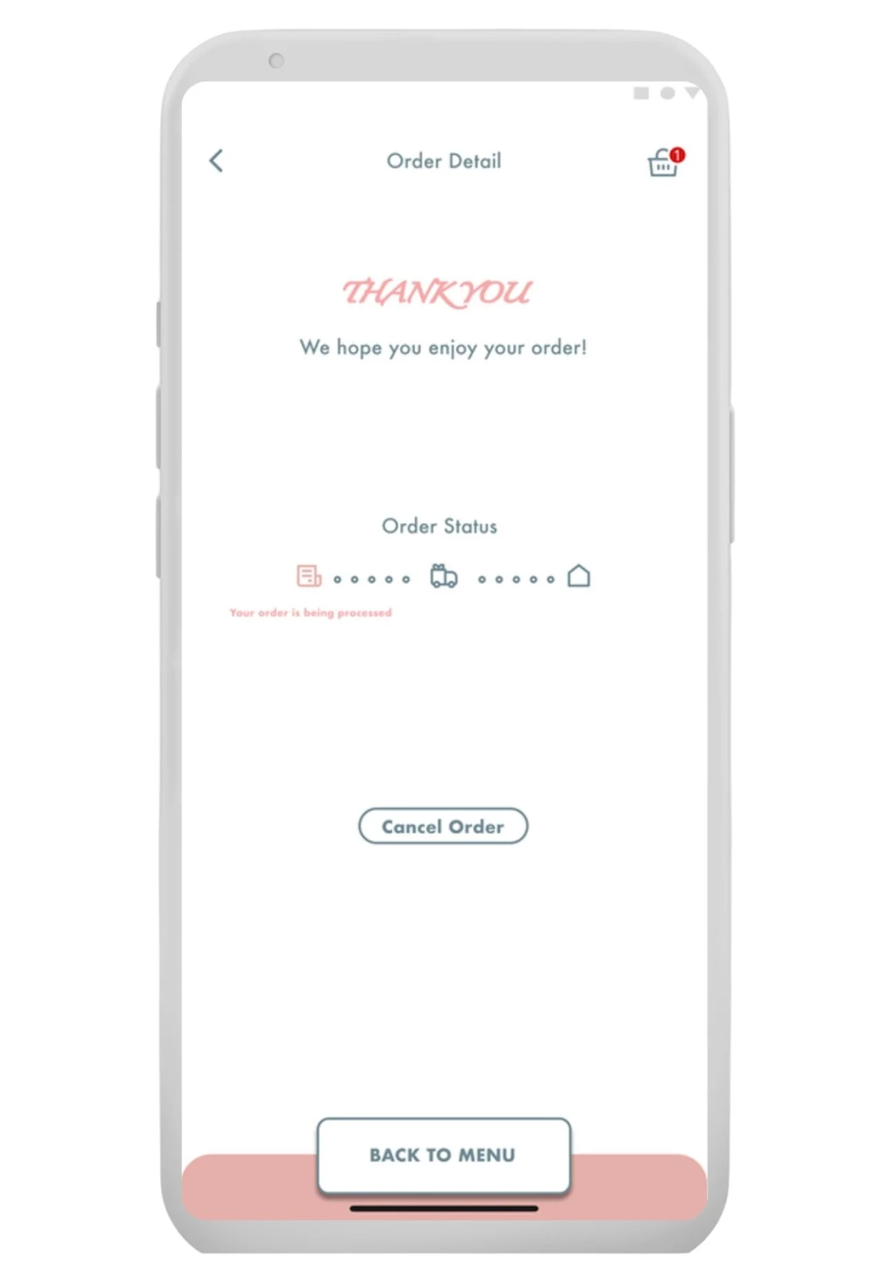
Order Tracking
This allows users to monitor the status of their order in real-time, providing peace of mind and transparency from preparation to delivery.
I then expanded Betty’s Bakery by creating a desktop version, designing a website to provide a seamless ordering experience across devices.
After finalizing the sitemap, I created the remaining wireframes to ensure a smooth user experience.
Low-Fidelity Prototype Flowchart
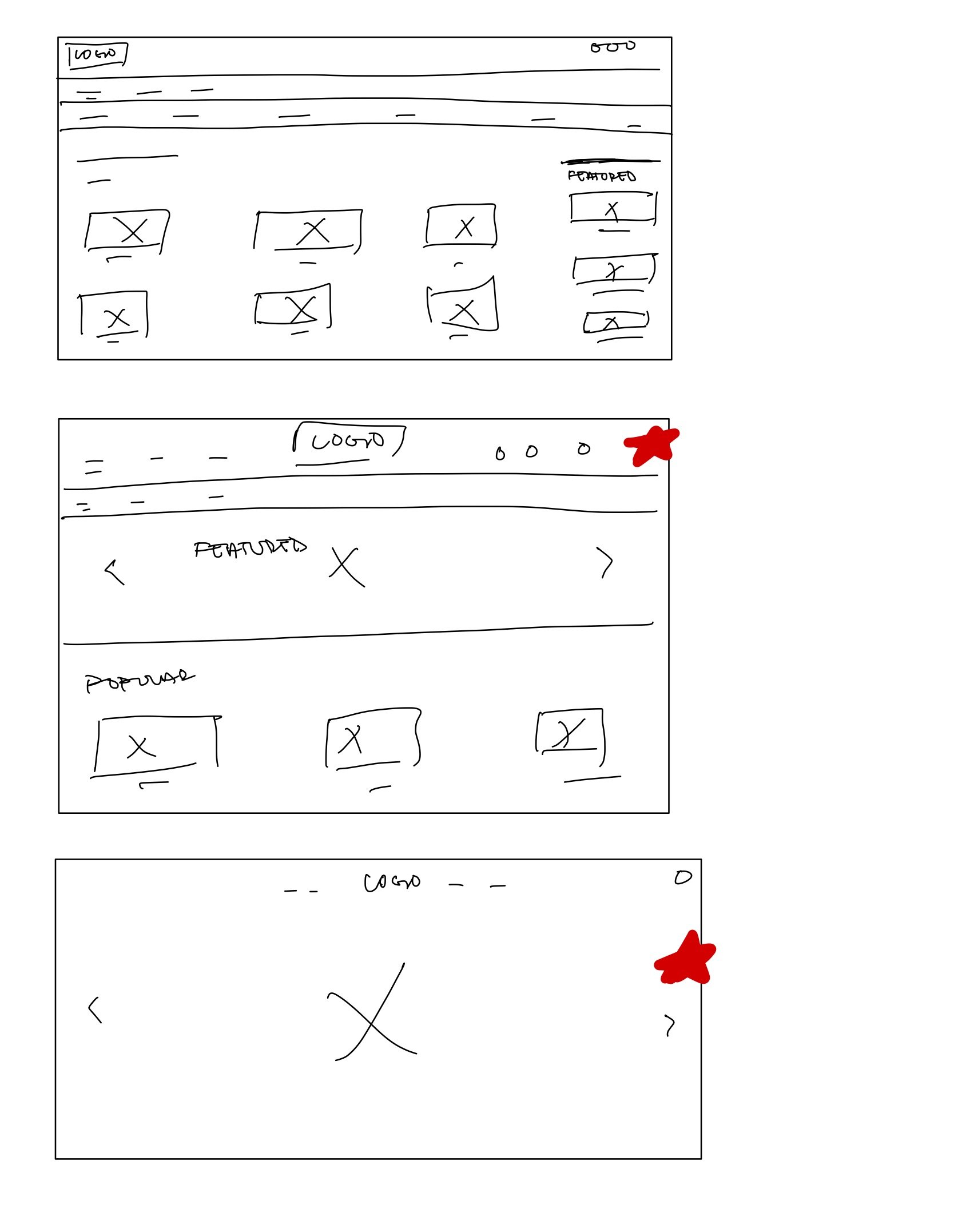
Crazy 8
I used Crazy 8 for the desktop version to explore layouts quickly. The red-starred concepts guided my final design.
Wireframes
Hierarchical Sitemap
I used the sitemap to structure the website, ensuring clear navigation and a smooth user experience.
Following this, I created the low-fidelity prototypes to establish the layout and functionality, focusing on usability before refining the visual design.
Afterward, I created the high-fidelity prototypes, refining the visuals and interactions to ensure a polished and user-friendly experience. Here are some examples of it.
High Fidelity Prototypes
Category
Home Page
Home Page
Cart
Drop-down Menu
The website includes a dropdown menu that allows users to easily select options from a list.
Check-Out Progress Tracker
This displays the stages of the checkout process, guiding users through each step with a clear numbered sequence.
Footer
Cart Preview
Quick Cart View
The mini cart is a dropdown that provides a quick overview of the items added to the cart, allowing users to review their selections before proceeding to checkout.
Check-Out
Going Forward ⏩
Takeaways
Creating Betty’s Bakery showed me the importance of user feedback and refining the design to meet their needs. Testing with people of all ages helped me see how different users interact with the app. What worked for me didn’t always work for others, highlighting the need for ongoing improvements.
I realized that sketching doesn’t capture every detail. The usability study showed what I missed, helping me make improvements with more confidence.
Next Steps
Moving forward, I want to explore new ways to improve the overall user experience.
Order Customization: Should users have more control over customizing their orders, or would a guided process be more effective?
Delivery & Pickup Preferences: Explore if users prefer set delivery time slots or the flexibility to schedule based on their needs.
Reducing Friction in Navigation: Identify ways to simplify the ordering process, ensuring users of all ages can easily find what they need.
Loyalty & Rewards: Determine if a points or rewards system would encourage repeat orders while also benefiting the bakery.


